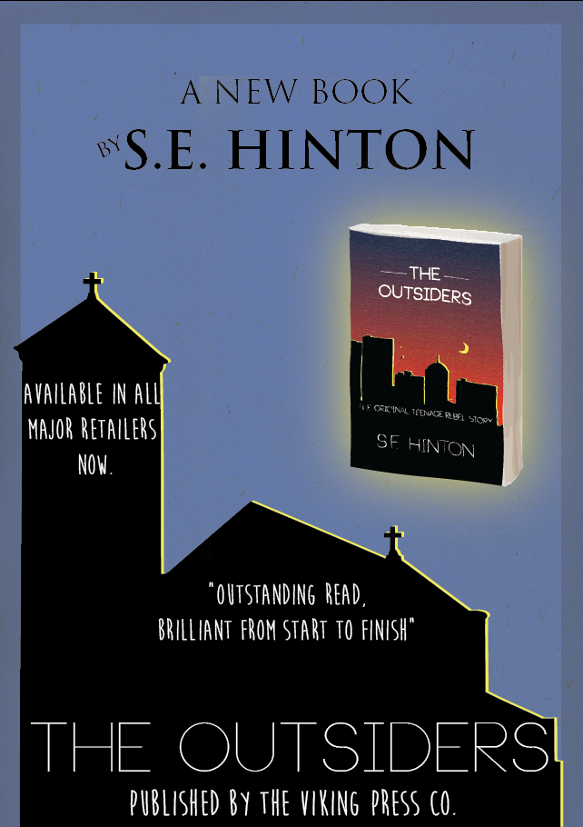
Secondly I saw that in many Book Posters for example the Jungle Book original poster made the emphasis on the Authors name at the top, and then further down the page, after the main focal point the book title, and this is what I have done here. (Link to junglebook image below)
I wanted to include a rating as I believe that its always important to give someone a second opionion from a reliable source e.g. a newspaper, as if its a good rating then they may be more inclined to give it a read as "because the Times said it was good, it must be!" thought process.
I added in the 'Available in all major retailers now to give the viewer a idea of where specifically to get this book if they are interested.
Below that, the publishers name to give credit where it is due.
After much deliberation I decided to use the church as the background as it differed from the actual book cover, however my final may change as I still feel there is something missing.
Jungle Book Image: http://upload.wikimedia.org/wikipedia/commons/a/ae/Jungle_Book_Rudyard_Kipling_poster.jpeg
No comments:
Post a Comment