Saturday 28 December 2013

Mockups So far

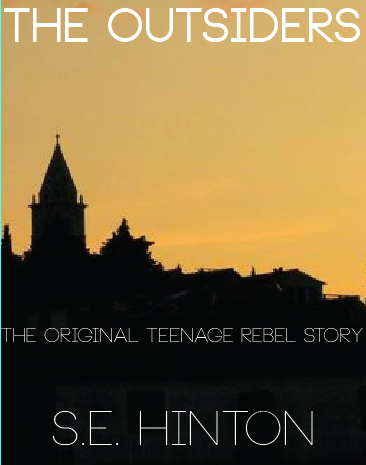
In that past week I've been working on some final mockups and adding those finishing touches! I couldn't come down on an one idea, whether to have the Church on the front cover in a silhouette or the city, so I did both!
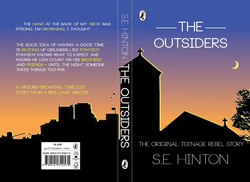
As you can see in this screenshot, the church works well at first glance but the more you look at it the more it just becomes a tower, with a triangle roof next to it, this along with the fact that it possibly gives too much about the story away, or focuses on the wrong part is why I decided to do multiple book covers and submit them both for marking! In terms of the sky colour I thought that it worked well at the top however when the orange clashes with the yellow highlight on the church it doesn't do it justice and you fail to see the contrast that I was trying to display.
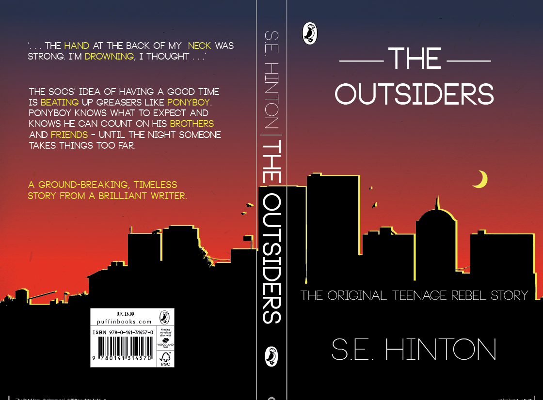
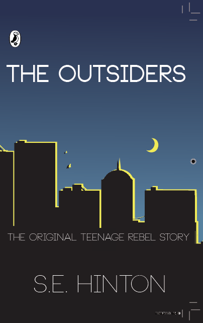
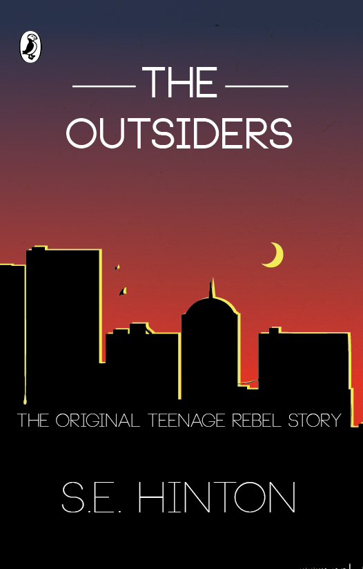
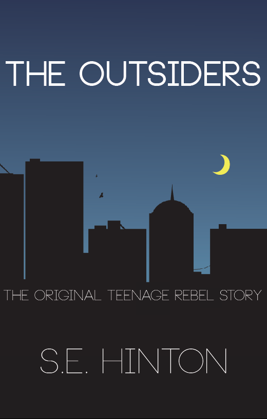
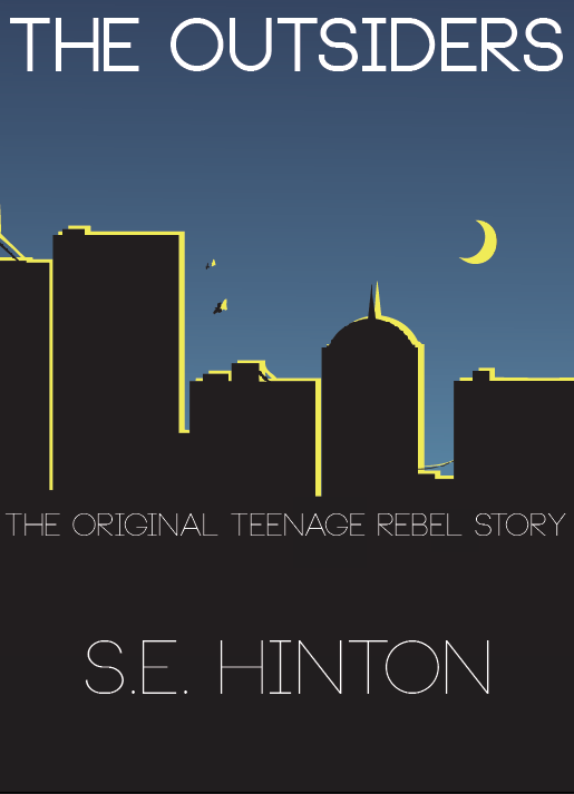
In this screenshot of the tower version of my Finals/Mockups you can see that the clear cut tower structures with the red sky against the yellow glow from the moon works really well and helps create that urban feel I was looking for. I also think that the red doesn't clash with any of the other colours on the page, for example on the back of the book where the last paragraph is all in yellow, against the orange on the church version it can be quite difficult to read. However I did feel that one residing positive from both of these was the back cover with the small scale buildings that were nothing too fancy.

When looking at the accuracy and relevance of both book covers, the church does have more story relevance and possibly makes it more appealing to a second time reader, however the city landscape in the distance create the 'outsider' feel more, it also plays on the isolation and acceptance theme running throughout the book rather than the church which is set almost as if your standing beneath it, part of the village, and not an outsider.

As you can see I'm very undecided and I am planning on submitting both to see what happens!

Saturday 21 December 2013

Title Development

Here is title that I've been using on all my mock ups to design around and I stepped back to look at my poster today and tried to work out what was missing, after much deliberation I realised that it was the awkward space above, and below the main 'The Outsiders' title. There was nothing textual based I could think of putting there to fill it up so I did some thinking and came up with a brilliant idea, to stage the writing on two levels. This not only makes it look more professional, it also emphasises the title, making it look 'grand'.

It reminded me of old American saloon bar signs, which would still be around in the era that the book is set!


Here you can see where the two lines completely change the front cover, they remove that awkward zone that was above and below the original title and make it a whole lot more professional (in my opinion).

The book cover gives a contemporary feel with influences from Andy Warhol's popart style, I think it works great in relation to the audience (Children books) As kids love bright, vibrant colours and its more likely to make them get their parents to buy it for them. Additionally the simplicity is easy to visually digest and doesn't make you lose interest as a result of over complication which happens a lot in book covers.

The staged title also gives a downward reading flow, you read 'The' and then 'Outsiders' which prompts you to look down the page to see the srtrap line, and the Authors name, whereas before you could see the 'The Outsiders' and might read horizontally.


Here is an Example, its so busy you can bearly see the Authors name at the bottom, and the whole thing is just messy!


Image Source: https://blogger.googleusercontent.com/img/b/R29vZ2xl/AVvXsEj4S17YYMrr1CmU35n-2dTPdGMDl3qyBH_PNgyCZUifnMOtZeJVjEvj85NvZtjV8xSn2nyTcgOQm7vbFQQYoQgA7zo9yyn-boayZ7TVaW0W9ww2dFsg-CqSZcdjRn7BMgf1EqW7TBrtJTyX/s1600/Messy+Room.jpg

Friday 13 December 2013

Experimenting with Focal Points

I thought as I haven't blogged in about a week I would show you guys what I've been getting up to recently. I had some really good ideas for a main 'focal point' on the page which I believe is key in attracting people to pick up the book in a store over other books.

I really liked the silhouette idea with the skyline of a village, or a church however I felt that was again, too far from the truth. A church does appear in the book and plays a reasonable part in the story however I felt that would of given too much away, or perhaps the wrong impression about the book, and definitely didn't give a gang warfare feel. So I thought I would focus more on the urban city approach and here is what I came up with.

The skyline took a while to draw, one I traced from a picture online and I wanted to get the edges perfect, a clean cut font cover is very important as I think it makes the book instantly attractive, as opposed to a busy choppy rough edge cover. (Thats just my opinion).

I'm really happy with the Skyline, and it continues onto the backcover, but I still felt it was missing something. So I added another layer of a skyline, in yellow. I thought as I added a moon I could have a 'lit up' edge to them and it would bring the whole book alive, making it more visually interesting.

As you can see it makes the cover 10x better, making it stand out more but also more realistic and applying that nighttime urban feel which is what I am trying to convey.

Thursday 12 December 2013

Further Idea Development

Since the last update I wanted to do further pursue the silhouette idea in which there would be a fading downward gradient and then a harsh block colour of the outline of something with relevance to the story, so I started doing some very broad experimenting  with different images and I came up with this:
Here I simply got a picture of a church silhouette from a small village and put it on a book cover template that I have cropped out in this picture, however it was more of a process of idea development, as you can see the title is in the original font with a slightly thicker stroke as I felt it needed to stand out more. The strap line positioned and fit very nicely just below the skyline and gave a path of vision towards the authors name at the bottom which makes it stand out suitably however does not take any glory from the main title which is very important when taking aspects into account for what the reader/customer in a book shop will see first.

The image itself is quite powerful and I'm glad the picture had a gradient like sky so I could see how it looked with a proper skyline and I think it works, definitely and idea I'm going to pursue.

Image Source: http://www.fotothing.com/photos/628/628bfb56206065c0731383915847fa63.jpg

Thursday 5 December 2013

Setting the Scene

I really wanted to set the scene for my book in a way that would appeal to the books target audience but also maintain a professional and sleek feel about it. After reading the entire book of 'The Outsiders' I wanted to think of something that accurately sets the scene for the book, but also give subtle hints to little events that occur in the book. I went through a lot of thoughts and different ideas, I came up with things such as Power lines silhouetted on a hill line with a small city next to it symbolising Tulsa (the City where 'The Outsiders' is set. However I felt this was too isolated and didn't give the impression that the book was set IN the city, more rather outside on the outskirts or another village. Here is the mockup:

As you can tell this is a very early version of the poster however some elements of it I really like and I think could be a positive factor in the such as the Font, its simple it stands out and it is easy to read.
Additionally the gradient provides a 'filler' for the background that other wise would just be block colour against block colour which doesn't work in my opinion. Finally the silhouette you can see in this picture although it is in a very early form here I think that if I worked on it I could create a very powerful effect with some kind of land mark, possibly a Church, or a Skyline as that has direct relevance to the book itself.