Thursday 30 January 2014

Presentation Day

Yesterday we have out presentation day for our current assignment, Time Based Media. I was prepared the day before the presentation and had the general idea of what I was going to say planned out.

I think this time round I structured the presentation more effectively and engaging than my previous and this helped to keep my colleagues entertained.

I feel that my presentation was confident, well executed and showed a structural chronological sequence of events that I researched and found inspiration from that allowed me to tell my story to what my final idea was. I first off started by giving a brief over view of the brief, to let people know what the rules and restrictions were that I was working inside of.

I then walked everyone through what types of things I looked at to get my inspiration with accompanying video clips, this appeared to go down well and everyone could really my thought and idea progression the more I explained which elements of my examples I wanted to adapt and use in my final design.

I then gave a synopsis of my chosen idea and justification why which allows the audience to reason with my reasoning overall increasing the reliability of my idea.

After that I took them through my hand drawn story boards and explained step by step in detail what each step entailed, e.g. what camera shots I am planning on using for each scene and adaptations. I then explained what was next for me in the process of making the film.

Overall I think that my presentation went well considering the time frame we had to prepare, I was concise, clear and demonstrated a chronological sequence of events that supported my final idea, the feed back also reflected this.
Tuesday 28 January 2014

More Research Into Time Based Media

I wanted to explore camera angles and specifically close up macro shots this gives a very close in focus shot of something of important and is a good way to force the attention of the viewer on something that they might not necessarily be interested in.

The video I'm going to be looking at in this blog post is this:
This is a Wickes DIY store advert showing off their professional ability to install kitchens and cabinets.

This advert really impresses me on two grounds. First of all its camera angles are very steady and has seem less transitions (See 0:20 seconds) Where the man walks past the camera and then as soon as he leaves it very subtlety cuts and the woman walks in the opposite direction. Additionally it has a lot of close macro shots that add to the entertainment purpose and atmosphere of the film.

On top of this it has what is the most appealing factor for me, the very detailed satisfying sound effects for example when he is stroking the worktop it makes a nice brushing noise that we hear in everyday life but extremely amplified this is definitely an aspect I'm going to use on my short film.

Further Research Into Time Based Media

When looking further into the time based media aspect of film editing I was searching on the Internet and found this clip.

It's a clip about these two (Brazilian again) free runners that have very cleverly put together a fast paced clip running  through the streets of Brazil.

At around 0:19 seconds into the film one of the guys runs and jumps over this marble fence and then as he goes over it it cuts to another camera angle of the same jump giving a great perspective of the jump and really engages the audience. I think this effect is very visually effective and visually appealing.

My overall idea which I briefly hinted at last blog post is going to be 'How to make a Cup of Tea' I think that the elements I have learnt from the two videos I have researched which are Black Cuts in between each scene, and different angles of the same action I think these two elements together can help achieve the 'dynamic' aspect of the film I'm looking for and that is required by the brief.

Tuesday 21 January 2014

Research Into Time Based Media

To get a good idea of how to further develop my idea I decided to do the first thing that comes to anyone mind that is seeking inspiration especially in design and that is Google it.

I Googled 'Fast Edit Film' and a few search results down I found this website:
http://listverse.com/2007/10/28/top-10-best-film-editing-sequences/

I'll be discussing some of the top 10 video edits that they have chosen and what I like/dislike about them and elements I could adapt into my final film.

First up: Cidade De Deux - City of God.


In this amazingly written and produced movie the clip you just watched above is the intro at the very beginning, the short sharp edits at the beginning of the clip with a sword being sharpened against a stone with just the brushing of metal against a rock sound and then cuts to black it is very profound and effective at instantly creating tension. I really like this cut to black for half a second I think it might be an effect I will use in my short film.

I also like how it shows two parallel stories at once, the first chicken that is taken and plucked and then put into a pot the chicken that escapes see's this and realises he is next and does what it must to survive, this maybe foreshadowing for the rest of the film where the main character the photographer boy does what he must to survive.

Friday 17 January 2014

First Looks At The New Brief

So we have been set our new Brief for 'Time Based Media' we have to create a 15-20 second film with our own created footage and this film sequence must contain at least 30 edits. This sounds like a lot but the whole idea of this assignment is for a fast paced snappy short film; whilst also managing to be "As action packed and dynamic as possible".

At first when we were being lectured about the new brief I lacked ideas that normally sprung to mind, however slowly as I started to think about it more and more I actually genuinely got excited! I won't reveal my idea yet as it is still in early stages but it's going to be about a household 'thing' made regularly across all homes especially in the U.K.

Tuesday 7 January 2014

My Brand Guideline

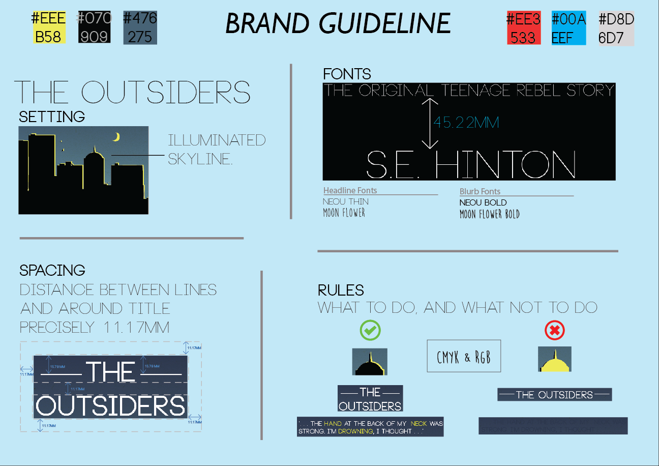
Here is my finished Brand Guideline/Style it includes everything I felt was necessary if someone were to try and replicate my design on a different book, or the same. The illuminated skyline aspect, the spacing around and in between the logo to ensure ease of legibility and also the rules of what to do, and what not to do in a more concrete fashion with some broad example. I also included the hexadecimal codes for the colours that I used during the creation of the Book cover and the A2 Poster.

I also tried to make it feel like a designed piece of work itself and wanted to do it landscape to do something different from the usual portrait designs I've been seeing on the internet.

On another note, Project deadline tomorrow! AHHH!

Monday 6 January 2014

Brand Guidelines

Now when I take a look at the brief  I thought I covered everything however, Brand Guidelines I missed the first time round, I've never really had much experience with Brand Guidelines and we've never been taught anything about it so I decided to take it into my own hands and do some research.

Here you can see an example of a brand guideline I found when I simply googled 'Brand Guideline'. It appears to be a general guide for outsourced design companies to follow when designing for a specific brand to maintain their brand image, and also product consistency. I guess this makes perfect sense as you wouldn't want a company designing something for you that didn't portrait your companies/products truly or to your standard.

As you can see this small screenshot contains the CMYK & RGB numbers for each of this companies colours that they use for the Logo, that includes the Icon and the Title. very specific colours to maintain that brand consistency so people can recognise the brand.

Next to that you can see a list of fonts under very specific sub headings of where they must be used, 'ITC Avant Garde' in Bold and Regular must only be used for the Headline Fonts, for Body copy Fonts it is different variations of Helvetica.

It seems to me like that it is a general guide to fall back on when ever unsure on any decisions, as there are some options within the brand guideline however it keeps you on track, there is some flexibility.

Here is a snippet from the Homebase brand guideline, it shows the top brand logo, that should ONLY be used on white backgrounds, that is the green text, orange O.

Below that it shows the Homebase in white text, with an orange O and says that you can use this type of logo colour scheme against any background that 'Optimises the visibility of both the brand colours'.

So again, there is flexibility but only a very limited amount.


I definitely think I'm ready to give my own brand guideline a shot now I know what to include; However the one thing I am unsure on is that we are designing a bookcover for penguin, so is it for the Brand Penguin, or specifically for our book? We'll see.


Image Sources: http://www.rawww.com/img/brand-guidelines.jpg
http://www.anoop-parikh.com/images/library/homebase_brand_guidelines_01.jpg

Saturday 4 January 2014

Designing the Poster

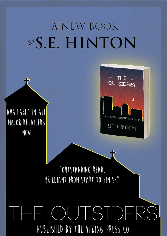
I wanted to design this poster with a similar layout to the one that I researched, I wanted to go for the Physical book style, this was to make sure that there was no confusion between if this was advertising a film or a TV series, which often can be the case.

Secondly I saw that in many Book Posters for example the Jungle Book original poster made the emphasis on the Authors name at the top, and then further down the page, after the main focal point the book title, and this is what I have done here. (Link to junglebook image below)

I wanted to include a rating as I believe that its always important to give someone a second opionion from a reliable source e.g. a newspaper, as if its a good rating then they may be more inclined to give it a read as "because the Times said it was good, it must be!" thought process.

I added in the 'Available in all major retailers now to give the viewer a idea of where specifically to get this book if they are interested.

Below that, the publishers name to give credit where it is due.

After much deliberation I decided to use the church as the background as it differed from the actual book cover, however my final may change as I still feel there is something missing.


Jungle Book Image: http://upload.wikimedia.org/wikipedia/commons/a/ae/Jungle_Book_Rudyard_Kipling_poster.jpeg


Thursday 2 January 2014

Existing A2 Posters

I wanted to take a look at existing A2 posters, and find out what they usually include, and just get a feel for what they should look like.

I did some research and here's what I found!

Here you can see a Poster advertising the launch of a book called 'Overkill' by James Barrington, a well known author.

When breaking the poster down, it is in 4 parts.

Short Statement: The designers have included a short statement to entice people into buying the book who are interested by this statement, its clear. bold. and short leaving an instant impression on the reader.

Focal Point: Secondly, we have the main focal point, in this case it is the book itself in physical form, this is common throughout all types of advertising to give the viewer a physical reference for them to identify when looking in a bookshop so they know exactly what they are looking for. This is very popular within the Food industry.


Author Name/Strap Line: Thirdly, the Author's Name & Strapline are in the same typography styles as they are written on the book, the Author is written in this iridescent block, gold typography that immediately stands out and gives (Me) the impression of fire, or explosions.

Below that, the strap line summarises the entire 'purpose' of the book and its place in the market, and why you should buy it. Because its the "New name in action adventure".

Sponsors/Outlets: Finally, the fourth and bottom most section of the poster is the sponsors and distributors of the book, giving credit to them. Next to that there is the outlets that will have this book in stock, so you know exactly what shop to go in to buy it, and you know what it looks like due to the physical portrail.

Image Source: http://www.jamesbarrington.com/Poster%201.jpg