Saturday 28 December 2013

Mockups So far

In that past week I've been working on some final mockups and adding those finishing touches! I couldn't come down on an one idea, whether to have the Church on the front cover in a silhouette or the city, so I did both!
As you can see in this screenshot, the church works well at first glance but the more you look at it the more it just becomes a tower, with a triangle roof next to it, this along with the fact that it possibly gives too much about the story away, or focuses on the wrong part is why I decided to do multiple book covers and submit them both for marking! In terms of the sky colour I thought that it worked well at the top however when the orange clashes with the yellow highlight on the church it doesn't do it justice and you fail to see the contrast that I was trying to display.
In this screenshot of the tower version of my Finals/Mockups you can see that the clear cut tower structures with the red sky against the yellow glow from the moon works really well and helps create that urban feel I was looking for. I also think that the red doesn't clash with any of the other colours on the page, for example on the back of the book where the last paragraph is all in yellow, against the orange on the church version it can be quite difficult to read. However I did feel that one residing positive from both of these was the back cover with the small scale buildings that were nothing too fancy.

When looking at the accuracy and relevance of both book covers, the church does have more story relevance and possibly makes it more appealing to a second time reader, however the city landscape in the distance create the 'outsider' feel more, it also plays on the isolation and acceptance theme running throughout the book rather than the church which is set almost as if your standing beneath it, part of the village, and not an outsider.

As you can see I'm very undecided and I am planning on submitting both to see what happens!

Saturday 21 December 2013

Title Development

Here is title that I've been using on all my mock ups to design around and I stepped back to look at my poster today and tried to work out what was missing, after much deliberation I realised that it was the awkward space above, and below the main 'The Outsiders' title. There was nothing textual based I could think of putting there to fill it up so I did some thinking and came up with a brilliant idea, to stage the writing on two levels. This not only makes it look more professional, it also emphasises the title, making it look 'grand'.

It reminded me of old American saloon bar signs, which would still be around in the era that the book is set!


Here you can see where the two lines completely change the front cover, they remove that awkward zone that was above and below the original title and make it a whole lot more professional (in my opinion).

The book cover gives a contemporary feel with influences from Andy Warhol's popart style, I think it works great in relation to the audience (Children books) As kids love bright, vibrant colours and its more likely to make them get their parents to buy it for them. Additionally the simplicity is easy to visually digest and doesn't make you lose interest as a result of over complication which happens a lot in book covers.

The staged title also gives a downward reading flow, you read 'The' and then 'Outsiders' which prompts you to look down the page to see the srtrap line, and the Authors name, whereas before you could see the 'The Outsiders' and might read horizontally.


Here is an Example, its so busy you can bearly see the Authors name at the bottom, and the whole thing is just messy!


Image Source: https://blogger.googleusercontent.com/img/b/R29vZ2xl/AVvXsEj4S17YYMrr1CmU35n-2dTPdGMDl3qyBH_PNgyCZUifnMOtZeJVjEvj85NvZtjV8xSn2nyTcgOQm7vbFQQYoQgA7zo9yyn-boayZ7TVaW0W9ww2dFsg-CqSZcdjRn7BMgf1EqW7TBrtJTyX/s1600/Messy+Room.jpg

Friday 13 December 2013

Experimenting with Focal Points

I thought as I haven't blogged in about a week I would show you guys what I've been getting up to recently. I had some really good ideas for a main 'focal point' on the page which I believe is key in attracting people to pick up the book in a store over other books.

I really liked the silhouette idea with the skyline of a village, or a church however I felt that was again, too far from the truth. A church does appear in the book and plays a reasonable part in the story however I felt that would of given too much away, or perhaps the wrong impression about the book, and definitely didn't give a gang warfare feel. So I thought I would focus more on the urban city approach and here is what I came up with.

The skyline took a while to draw, one I traced from a picture online and I wanted to get the edges perfect, a clean cut font cover is very important as I think it makes the book instantly attractive, as opposed to a busy choppy rough edge cover. (Thats just my opinion).

I'm really happy with the Skyline, and it continues onto the backcover, but I still felt it was missing something. So I added another layer of a skyline, in yellow. I thought as I added a moon I could have a 'lit up' edge to them and it would bring the whole book alive, making it more visually interesting.

As you can see it makes the cover 10x better, making it stand out more but also more realistic and applying that nighttime urban feel which is what I am trying to convey.

Thursday 12 December 2013

Further Idea Development

Since the last update I wanted to do further pursue the silhouette idea in which there would be a fading downward gradient and then a harsh block colour of the outline of something with relevance to the story, so I started doing some very broad experimenting  with different images and I came up with this:
Here I simply got a picture of a church silhouette from a small village and put it on a book cover template that I have cropped out in this picture, however it was more of a process of idea development, as you can see the title is in the original font with a slightly thicker stroke as I felt it needed to stand out more. The strap line positioned and fit very nicely just below the skyline and gave a path of vision towards the authors name at the bottom which makes it stand out suitably however does not take any glory from the main title which is very important when taking aspects into account for what the reader/customer in a book shop will see first.

The image itself is quite powerful and I'm glad the picture had a gradient like sky so I could see how it looked with a proper skyline and I think it works, definitely and idea I'm going to pursue.

Image Source: http://www.fotothing.com/photos/628/628bfb56206065c0731383915847fa63.jpg

Thursday 5 December 2013

Setting the Scene

I really wanted to set the scene for my book in a way that would appeal to the books target audience but also maintain a professional and sleek feel about it. After reading the entire book of 'The Outsiders' I wanted to think of something that accurately sets the scene for the book, but also give subtle hints to little events that occur in the book. I went through a lot of thoughts and different ideas, I came up with things such as Power lines silhouetted on a hill line with a small city next to it symbolising Tulsa (the City where 'The Outsiders' is set. However I felt this was too isolated and didn't give the impression that the book was set IN the city, more rather outside on the outskirts or another village. Here is the mockup:

As you can tell this is a very early version of the poster however some elements of it I really like and I think could be a positive factor in the such as the Font, its simple it stands out and it is easy to read.
Additionally the gradient provides a 'filler' for the background that other wise would just be block colour against block colour which doesn't work in my opinion. Finally the silhouette you can see in this picture although it is in a very early form here I think that if I worked on it I could create a very powerful effect with some kind of land mark, possibly a Church, or a Skyline as that has direct relevance to the book itself.


Saturday 30 November 2013

Moodboards

I decided to put some images together from Google in a Photoshop document to get a good idea of the type of things that summed up that era (the 1960s).

On the top left picture I searched '1960s Oklahoma' and compiled some images that accurately relate to the book 'The Outsiders'.

Here you can see typical images of objects that you would expect to see in that era.

I did this arrangement of images initially to get some ideas going and just get some inspiration on what I was going to design my front cover on.


Here in this second moodboard I arranged the images of previous book cover art done for 'The Outsiders' to see what design theme they went for, and throughout I can see that a consistent gang/violence atmosphere has been put across, definitely something to think about when trying to convey meaning to the reader.


I found this second moodboard especially helpful as it helped me get an idea of what main focal point to use that would accurately describe the book.


Image Sources: https://www.google.co.uk/search?site=imghp&tbm=isch&source=hp&biw=1521&bih=927&q=the+outsiders+book+cover&oq=the+outsiders+book+cover&gs_l=img.3..0l5.1250.3071.0.3267.24.13.0.7.7.0.149.1239.8j5.13.0....0...1ac.1.32.img..4.20.1259.VHT9K17QYvQ

-https://www.google.co.uk/search?site=imghp&tbm=isch&source=hp&biw=1521&bih=927&q=the+outsiders+book+cover&oq=the+outsiders+book+cover&gs_l=img.3..0l5.1250.3071.0.3267.24.13.0.7.7.0.149.1239.8j5.13.0....0...1ac.1.32.img..4.20.1259.VHT9K17QYvQ#q=1960s+oklahoma&tbm=isch

-https://www.google.co.uk/search?site=imghp&tbm=isch&source=hp&biw=1521&bih=927&q=the+outsiders+book+cover&oq=the+outsiders+book+cover&gs_l=img.3..0l5.1250.3071.0.3267.24.13.0.7.7.0.149.1239.8j5.13.0....0...1ac.1.32.img..4.20.1259.VHT9K17QYvQ#q=greasers&tbm=isch

Tuesday 26 November 2013

Extended Research

On the weekend I spoke to my brother in London about getting Inspiration for my work, as he works in the Industry as a Web designer and I thought he could point me in a good direction. He did! He told me about a cover art designer who used to work for the company he does (POKE) and I checked out her website and there is some awesome stuff on there!

www.annaheath.co.uk is the website and here are some examples of the work she has done.

 This cover art is all hand illustrated even the typography itself is hand drawn. The image on the left hand side is the front cover and the image on the left is the plan of the book; front, side and back.

I really like Anna's work, it all really has its own style that is obvious in all of her work. One of the things I like most about her work is the continuation of the elements across the page here for example the shoal of fish spread across all the way to the back, this is almost a path for the reader to follow if they pick it up in a book shop.


 Here is another example of the continuation of design elements, I really like the effect it gives and I definitely will make sure I use this idea when designing my book cover art. I also think the hand drawn typography gives it such an original feel and sets it apart from anything else that uses a bog standard preset. The visual connotations are also very impressive, it shows a man on a boat, sailing on clouds towards a snow storm. Clearly this is a scene from the book and it makes me very interested to find out more instantly achieving the objective of trying to get people to buy the book and enjoy it.

Tuesday 12 November 2013

Research into Penguin Books for Competition

So to start off my research into designing the one of the two book cover arts I decided to start reading the books, this would give me a good understanding of the approach and visual style I would want to go for, I also think that it would help give me a more accurate design idea that would help represent the book to what it truly is in my opinion and not from someone else synopsis on the internet.

Just from reading the blurbs I have decided that I am going to start reading the Outsiders.

I feel that the impression I received from the blurb is that this book will offer a more mysterious story line that could be interpreted and advertised in a number of ways, however the What a Carve Up! book also looks like it has good advertising and design potential, as the main theme seems to be set on greed, this could make for some good content, the first thing that springs to mind is a design style with silhouettes and bright colours on contrasting on the background similar to the hustle gambling drama on BBC 1.

Monday 4 November 2013

Considering the Visual Language

So I've finished my Final Poster(s) required for our first Assignment and I really enjoyed doing it! It was difficult at first trying to put myself in the mindset of creating something to specifically appeal to Females however once I started to do some research I quickly began to generate useful ideas that would help me target my poster more towards recruiting females.
As you can see in the screenshot on the right hand side, I wanted to make it clear and stand out and most importantly stick to the brief. Throughout the designing a building process of both my posters I kept to a constant colour scheme, this was partly influenced by my sketchbook experiments and partly from my research online, here is an example of the colour scheme I followed.
I tried to get a nice combination of pastel light colours which combines dark Steampunk influences with bright popart colours. The purple will be used primarily to stand out and catch the viewers attention, the brightness of it will also appeal directly to the female audience. The darker green will be used as a background colour to make the other colours stand out, the same goes for the lighter green. The duck egg yellow shade will have multiple uses including outlines, text and shape strokes. Finally we have the blue I followed this for my Neutral themed poster to give a similar effect as the pink but more universally appealing.


The layout of the poster took a lot of thought I wanted to make it easy to visually digest from a passer's by perspective but be interesting enough to grab their attention and make them take a second look, this I found, was a very difficult balance to find.

I played around with positioning for the main focal points of the poster such as the molecule structure in the middle and the atoms on each side and I found the positioning in which they are currently in the picture to be the best layout.

I also had some queries about choosing typography as I felt it was important to select a font that not only was clear, easy to read quickly and sans-serif but also to be relevant and I think this font immediately expresses science when I look at it, with a hint of a retro feel.


Despite this assignment being a challenge I have really honed my Illustrator skills, being terrible at drawing accurately with free hand I was a bit anxious to start using Illustrator as it is a very 'drawer friendly' program, or so I first thought. However once I started using it more it became clear that it has endless possibilities and is just a more creative version of Photoshop. The main skills and tools I have learnt and used in this Assignment have mainly been the Shape Tool(s), Pen Tool, Add & Convert Anchor Point Tool and the Ability to draw on paths and use Compound Paths effectively.


There images are the Neutral poster, the female oriented poster and an example of the font I used and the name of it 'Science Fair'.


Some of the elements in my poster such as the atoms I added for extra visual entertainment, when I glanced at my poster after not looking at it for a while it wasn’t 100% obvious what I was looking at whether something to do with health, or science so I added the classic atom shape as it immediately re-in forces the science feel.


The other elements I added were informative practical text in case my poster was actually used for practical reasons, the room number and the course name for extra re-enforcement for those who are interested, I felt this aspect necessary as I find I word better when putting it into a realistic scenario.


Sunday 3 November 2013

Evolution of my Project

As I'm drawing to a close to the end of my project I wanted to write up a summary of the evolution of my poster form the beginning and how it progressed to get to where it is now.

In this picture on the left was my first step into making the basis of my poster, I wanted to give a bold impression from the very start, I did this by having the main title text staggered in a top to bottom format. My reasoning behind this is because people when reading anything quickly, or posters in general they read from top to bottom to get a quick general feel of what it might be about and if they are interested or not.

The font I used was Science Fair a great font that gives a science and old school impression.

I also wanted to create a background that would make a nice contrast against my chosen colour palette but also not be a distraction.

In this picture I played on looking at the main focal point of a poster, I wanted to have something big, noticeable and relevant to the subject. In this case I chose the hazardous symbol as I feel that it nicely infers the topic of science. I had some experiments in relation to the position of the main focal subject and I felt that in the screenshot on the left wasn't detailed enough and not suitable to using in colleges around the country (bearing in mind the practical purposes).

I also wanted to consider information text to make it practical as I noticed that if people actually wanted to use my final product I would have to account for space for Room Numbers, specific subject i.e. chemistry, biology, physics so I kept this in mind when designing from this point on wards.


At this save Poster 1.3 I drew a different centre piece, a molecule structure I felt this wasn't so male oriented when compared to something like the hazardous symbol and was a more neutral universal looking image that everyone would recognise.

You will also see that I changed the fill colour, this again was in an attempt to make it slightly more oriented towards females (a good recommendation from my girlfriend).

I put a lot of thought into how to detail the molecule structure and I decided on adding a stroke this would not only draw emphasise to the object but also make the poster more striking.


As you can see in this picture I added the same colour stroke as that was used on the title font, this makes it look consistent and also allows the user to flow down the poster by almost linking up the title text with the molecules.


I also made the fill of the molecules pink, this at first looked like quite a challenge however I quickly discovered that I can quickly use the Eye Dropper tool (with appearance copy enabled) I can click on something with the desired fill & stroke colour whilst having the object I want to mimic the look selected, this saves a lot of time and saves me from having to group, then change the fill and stroke then un group.


 At this point in the design of my poster I realised that the background was very plain and needed something to not only making it more visually entertaining but also to make the bottom main informative tag line stand out.

I added a cloud around the bottom of the 'GET INTO SCIENCE' just to make it stand out more however I feel the colour was mis fitting and didn't match the rest of the colours in the poster.

In the background I added some simple light rays which gave it a 'metropolis' feel in my opinion and also a hint of retro steampunk.


I then added more sun rays to even it out and tried to make it as semetrical as possible to make it look more professional and visually appealing, I also changed the fill and stroke of the cloud to make it less vibrant and more of a suggestion.


Despite changing the cloud colour I wanted to play around with more shapes that might look better for example a semi circle could look cleaner and match the circles that are in the molecule structure giving it consistency throughout adding to the professionality.


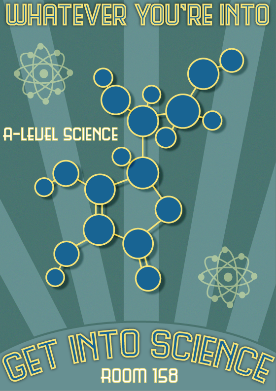
At the near end of my poster design I changed the cloud at the bottom of the poster to a semi-circle like I originally planned and I also moved the 'ROOM 158' information text to the bottom of the poster inside the semi-circle, this gave it a really nice look and also threw in information without the audience having to look out for it as the title would be the first thing they read.


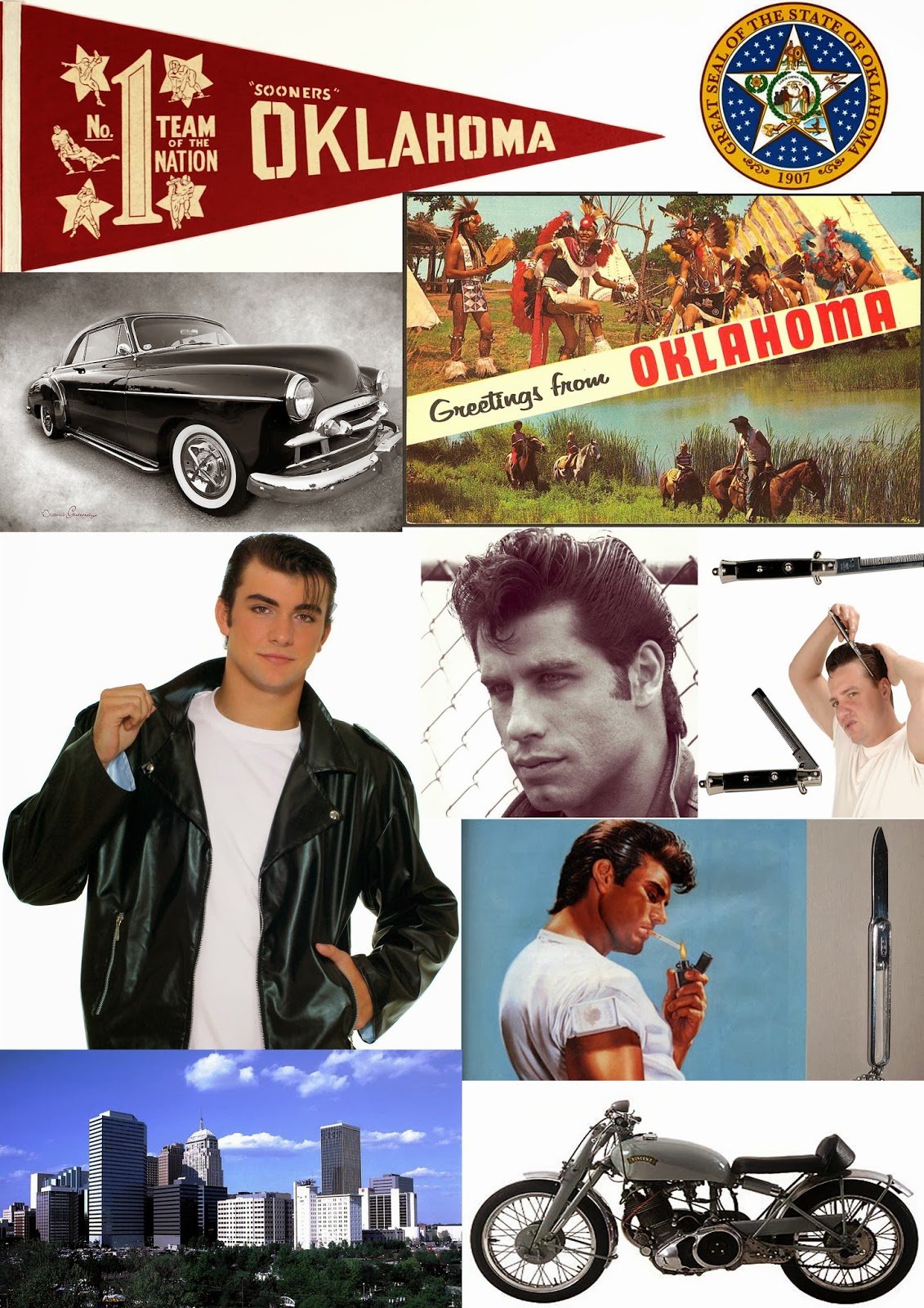
Finally I wanted to fill some empty space that was around where the atoms are now, this not only gave it a more 'sciency' feel but also kept it busy and nicer to look at especially when trying to appeal to females more than males, this would also be the reason why I have chosen a pink colour for the majority of the elements in my poster.


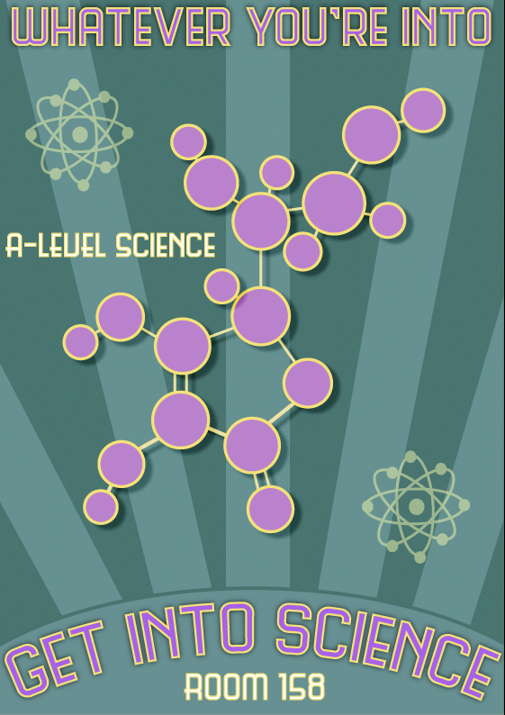
Here is the alternative poster that I created with a different colour scheme to be a more neutral and appealing towards males, I wanted to do this so I could have a wider range of practical applications if needed or chosen by the college to actually use this poster.

Wednesday 23 October 2013

Presentation Week!


This week in class we had to present our ideas, findings to the class for critic and feedback. The actual build up to the presentation was somewhat rushed, however I managed to get it all prepared the day before the day of presenting (16th October Wednesday). I had rehearsed some of the slides that needed additional execution to make sense of the presentation.

So what was the content? My presentation consisted of a logical build up of explaining the processes that I went to in the prior two weeks, the research, the idea generating, the sketches that enabled me to build a clear picture of what I wanted. I also looked into colour schemes in a new creative way for me that was different from what I have been doing in the previous A-Level course. Furthermore I looked at a wide range of typographies to give the greatest impact when people walk past this poster which is an important aspect.

How did the presenting go? The presentation went a lot better than I expected, I was anxious before I started as I hadn't done one in a while and presenting to new people is always stressful, however I quickly got back into it and posing challenging and thought provoking questions to the audience to keep them engaged. I managed to explain and get my ideas across in the way that I think of them which is important to me.

Feedback on the presentation/presenting skills?
My feedback on my presentation was very positive, I scored 1 or 2 on every category and commended for my fluent speech and not using notes. My colleagues also said that my explanation of ideas was very entertaining. In terms of criticism I should of added mock-ups which is a valid point and I shall act on soon.

All in all it was a successful milestone in this assignment and I enjoyed it!


Tuesday 15 October 2013

Pop Art!

Another one of the main styles we were told to base our assignment on was Pop-Art. Pop-Art was probably the one art style I knew/have seen the most of . The artists take a ordinary picture and modify it into a comic-book art style that looks like it has been drawn with crayons and pastels, this is a very dramatic look and can enable to artist to translate massive emotions/actions easily with just a few colour strokes, as you can see on this picture below, the woman has a white strip by her right eye which shows she is distressed or worried.


Pop art is a very cool and visually attractive art style for me, I think that it takes the basics of other art styles and just makes the message obvious which is the main objective when advertising with this style, which is why it could be very useful for a Science Recruitment Poster, bright, colourful, and eye catching with a simple scene to portrait a message quickly and successfully.

In this second picture of popart examples I found one that specifically shows Science in relation to popart so I myself could get a better idea of how I was going to execute the design process. It clearly shows how easily an area of science can be displayed by just colour schemes and contrasting colours. I like the fact that you can immediately get the impression of what the poster is about without any text, this will be a great colour scheme to follow when producing my poster.

Again I wanted to find out more about the history behind Pop-art, it seems that It originated in Mid-1950's in Britain and Late-1950's in the US, and further supports my idea that Popart is mostly used in Logos and product labeling as it gets peoples attention and is just genuinely visually appealing.

Image 1 Source: http://www.osnatfineart.com/images/girl-with-hair-ribbon.jpg
Image 2 Source: http://thumbs.dreamstime.com/x/pop-art-objects-science-medical-9543217.jpg


Tuesday 8 October 2013

Looking at Early-20th Century Sci-fi Movie Posters

When looking at the content of this movie poster I can see that immediately the posters text is in Russian or a similar language, in the middle the poster there is a man wearing a bowler hat, he's wearing glasses and his face is mostly covered with yellow, underneath him are two people a man and a woman sitting on a bench, they have no colour they are just grey with text in between them, there is also title text at the top, this is the biggest and most eye catching typography on the page.

This poster shows a combination of things that are completely possible, but also definitely at the same time drawn from the imagination, with the mans face coloured blue and yellow with a red bowler hat this is certainly not a everyday occurrence, who ever drew this poster definitely had a very interesting and wild imagination, the colours themselves are very psychedelic and bright . I haven't seen any movie poster like this before, the typical layout are dark colours and informative 'cool' pictures/texts however this is very different. The immediate impression that the poster gives me aside from the fact I already know its a movie poster, is that it might be something to do with the mind, the way the two people are set apart and their facial expressions tells me that they are scared or worried and the abstract colours also give me the impression of a 'mind' or 'mind game' also the sinister look in the mans eyes gives him a 'mentalist' look.

When looking at the form of the Poster, the two people sitting down in at the bottom of the poster are sitting apart at such a distance which is telling me that they are being held apart, and perhaps they are being held apart from the huge head which is placed in between them, both their body language is also showing that they might know each other however are unable to communicate. The large head in the middle of the poster is definitely the most important feature of this piece of work as it takes up around 90% of the poster and is so striking, not only the size but also the lary bright colour scheme instantly gets your attention and the simplicity of it keeps you interested.

The most memorable thing for me about this posted is definitely the colour scheme, as it's an early 20th century poster the buildings/surroundings of this would of been quite dull, so bright reds, yellows and blues would of caught anyone's eye and make the viewer immediately interested, not only that but the contrast of those colours again the grey smaller people also makes it more visually appealing.

When doing some further research on this image and this poster is from Soviet Russia drawn by Paul Lafargue for a film directed by Nikolai Okhlopkov, unfortunately the film that was based on Glutton millionaires was lost in a fire in WWII.

Image Source: http://en.ria.ru/images/17545/68/175456847.jpg


Sunday 6 October 2013

Steampunk

First off, I was shown the brief for our first assignment and our basic objective in a nut shell is to create a interesting and visually catchy poster for a A-Level science courses across the country. The brief also states that it would like you to follow the design styles or show similarities/influences from artists such as Steampunk, Victoriana, and Popart.

Coming from the A-Level iMedia course last year I thought I would be equipped for this degree course however I can now see that some basic knowledge of the founders of styles that we see and use today just aren't taught, so I'm going to some research!

Let's start off with Steampunk, now the first thing I see when I google 'Steampunk' is:

"Steampunk is a sub-genre of science fiction that typically features steam-powered machinery, especially in a setting inspired by industrialized Western civilization during the 19th century."
-Source: http://en.wikipedia.org/wiki/Steampunk

This small paragraph has perfectly coined what I see Steampunks looks like:


 These are some images that I took from google images when I searched 'Steampunk'. When first looking at the photo it looks very dark, dirty and old fashioned, however when you continue to look the outfits on the people are clean, the picture is surprisingly well lit and you can see that its a recent photograph from the quality. This is all the style of steampunk and I'm starting to understand it now. In the background of the picture to the left is a huge steam engine, and with the man and woman stood in front of it gives me the impression that they are operating it. However it is just another illusion everything is a prop and staged but the way in which it is done is very deceiving.

-Image Source: http://en.wikipedia.org/wiki/File:Kyle-cassidy-steampunk.jpg


In this second photo that was the first search result when searching steampunk seems to be a bit more clearly representing that style. The image shows a very Victorian pale man who is dressed smartly and holding a cane, this immediately gives the impression of a upper class member of the public, and completely mis-fitting is a mechanical golden prosthetic arm that is held on with a harness, this is so different from the rest of the photo it really catches you attention, and could be a big factor as to why Steampunk is so well known due to the fact that it is just so hard to miss. The photographer who I found out through research was David Lynch has very cleverly made the man pose like a Victorian would if they were getting their photo taken to furthermore increase the difference between the two areas of the photo and also further confuse the viewer, with all of this set against a pale white background it makes everything stand out that little bit more.


-Image Source: http://upload.wikimedia.org/wikipedia/commons/2/2b/Steampunk-falksen.jpg


Aside from just analysing some images that were directly representing the style of 'steampunk' I wanted to find out a bit more about the origin of the term, and style to help me understand it further. So I continued to read on Wikipedia and it seems that the term 'Steampunk' was originally coined by an author named K. W. Jeter who was looking for a general term for a novelists work (Tim Powers) who often wrote about Victorian fantasies.

All of this information to me seems very dated however looking at the dates this style only really came around in 1980, maybe its just the effect of all these Victorian/Robot images?!

Anyway, thanks for reading and next i'll be looking at Victoriana to try and get some history behind that.

Tuesday 1 October 2013

First Post!

First Post!

Just begun my first week on the Digital Media Design course, it's looking really interesting and I cant wait to start the first assignment of creating a Science recruitment poster. I'm also looking forward to further enhance my design skills on top of everything I learnt last year.