Tuesday 25 March 2014

Feedback from Crit

Todays Tuesday lesson was our crit of our iBook to the rest of the class, I felt that this was a really good opportunity to get some constructive feedback on my iBook as I myself felt like there was something missing but I couldn't figure out what it was. After successfully showing the half completed version of my iBook I have my peers took it quite well, here is the feedback given:

Positive
  • High Quality images make it look professional.
  • The flat colour scheme works well drawing attention to the pictures.
  • My content interactivity was suitable and factual for my audience (sound bytes of animal noise).
  • Good title font choice.
Negative
  • Background of each page was plain, and needed a bit of attention.
  • The second page of each section's layout was wrong and needed to be addressed (black boxes)
  • Information font should be different from title in all cases.

So I took this feedback and went away and made all the changes that I agreed with, and in this case it was all three of the negative feedbacks I received. I found this additional insight really helped me develop my iBook into a much stronger piece of work overall. 

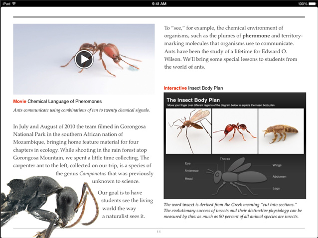
I changed the background of each page from a flat pale green to a rough bordered two tone green which gave each page a cutout effect. (see pic 1) I also completely redesigned the second page of each section by using the pen tool and creating rough cutout shapes again which I placed the text within this gave it a great new look which will appeal to younger audiences. (see pic 2)

Finally I changed the information font on the second slide a thin and professional font 'Helvetica Neue' (see pic 3).

(Pic 1) & (Pic 2) & (Pic 3): As you can see here on the left hand side of the image there is the rough edged two tone green border I was referring too, you can also see the shapes that I replaced the black boxes with to put the text inside. And it also shows the new Helvetica Neue font for the second page information I used instead of my title font 'Moon Flower'.


Saturday 22 March 2014

Interactive Design Principles

Throughout my design process of my entire iBook I wanted to keep a few things constant. Firstly I wanted to Meet the Users Expectations by providing a good Experience. When using a product for the first time there is definitely going to be some kind of learning on the users half, whether it be learning how to find your way around the iBook or learning the style in which the information is written.

Secondly Consistency, I felt that this was also another very important aspect of any product that will be received by the public. Consistency will ensure that the User only has to learn their way around things once, and they won't get confused. I applied this into my iBook with flat tone green colours and information in little chunks, this avoids the problem of the reader becoming overwhelmed by text.


Finally Engagement, this an equally important element of any design principles, it measures the extent of which the user has a meaningful experience with the product/design. In this case I added sound bytes and actual locations of animals to get the user further involved and create a more meaningful experience.

Image Sources: http://www.bluefountainmedia.com/blog/wp-content/uploads/2013/04/walloftext1.png
http://media.smashingmagazine.com/wp-content/uploads/2011/03/expectations.gif
http://glennas.files.wordpress.com/2010/08/experience1.jpg

Wednesday 19 March 2014

User Testing

I wanted to make sure that my iBook was fit for use by anyone that would require so I did some user testing. The first User to test my iBook was my Girlfriend. Immediately after just a few minutes after opening my iBook on her iPad she made a really good point.

This was Leigh-Anne's point: 

"When you navigate from the main menu of Mammals, Amphibians and Reptiles, Birds and Trees into their sub-sections for example, Cougar in Mammals when you press 'Home' after reading the information it takes you back to the main menu of the four main categories and not the Mammals Chapter Home page." - I felt this was a really good point to make as it quickly became frustrating after I realised it myself, here is how I changed it.


Old Method of Navigation:


Here you can see a visual representation of the old style of navigation, it wouldn't go back to the Mammals section instead right back to the home page when you clicked 'Home'. I felt like this is a bad idea and would feel much more fluent if it took you back to the mammals page, and then you could press 'Home' again to go back to the main menu.


New Method of Navigation:


In this screenshot you can see the new way of navigating my iBook after the User Testing, you go from Main Menu, to Chapter, into section and Back to Chapter when you press Home.

Sunday 16 March 2014

Development of iBook

I wanted to cover some design aspects of my iBook that I didn't look at in my previous blog post.
Here is my section on Cougars, this screenshot is the second page of the Cougar section. I felt like I wanted to take a more 'fun' approach to designing my iBook as initially I wanted to make it very technical and professional which is difficult when using iBooks Author as its tools are very limited.

I've added several things to this page and kept almost nothing of the old second page design, I wanted to put all my text boxes in green 'cutout' style boxes, this draws attention to the information and separates it from the rest of the page and gives it a certain hierarchy over the other less important elements on the page. I added more interactive elements as well in the top right of the screenshot you can see my Bookry Google Maps widget this when pressed takes you to the exact location of that animal in that section which is a nice touch, it makes it more personal and real that you can see where they are right that moment. I wanted verbal interaction as well as visual so I decided to add some sound bytes, in this case the roar of the cougar this again instantly makes the user learn the noise of a cougar and probably more interested in learning more.

Finally I wanted a short burst of factual information that is quick and easy to read this would get the reader clued up very quickly on short little facts about that animal and it gives the reader a break from a large paragraph of information.


Thursday 13 March 2014

Progress of iBook

So I started to actively develop my iBook. I wanted to take a few things into account before I actually started to design each page layout, one of these things being freedom and non-linear navigation, I  felt from my previous research into iBooks that you were forced to follow the authors trail of information and I felt that it left people feeling irritated. So I decided to use a rather messy but once polished effective method of non-linear navigation.
In this screenshot above you can see my final starting navigation design. I wanted to create something that was very simple with no question about how you navigate from chapter to chapter and I think that the simplicity of my design does this well, it leaves no room for confusion and having complicated navigation is one of the worse design offences in my opinion. I originally wanted to go for a Flat UI design approach however after reviewing that this will mostly be a factual book it is key to contain as many factual elements as possible, for this reason I decided to go with a half flat UI and half image design style.

As you can see in each of the thumbnails I chose very high quality pictures, I felt this would not only make the book more entertaining and visually pleasing but also make it more professional.

Tuesday 11 March 2014

Research into ways of displaying information

Whilst I was looking for inspiration I came across this little image, it clearly lays out three different services in simple and effective ways. I thought of a way I could interpret this into my own iBook and I figured I could have a simple illustration like in the picture above however have a fact such as "10% of the worlds known species live in the Amazon Rainforest" or "140 Inches of rain fall per year in the Amazon Rainforests" or "There are 400 Billion trees in the Amazon Rainforest" These three facts could directly relate to the picture that is currently there now and with a simple title and additional information at the bottom would make a good layout. This combined with the fact is has elements of a Flat UI is a bonus and the colour scheme on the page is also very professional, the light pastel colours really help neutralise and relax the reader which is important to keep someones attention for long periods of time.

Image Sources: http://www.ri-web.com/wp-content/uploads/flat-web-design-2.jpg

Interaction Design Presentation

Today we had our presentation in class and above you can see the presentation that I used. Initially I felt that I didn't have much inspiration or design ideas to go off however once I started making this presentation it became clear that indeed I did have multiple ideas and the structure of my iBook was already done when I made my division of chapters and structures. (see previous blog posts).

My presentation skills were on form today I was concise, descriptive and engaging. The feedback I was given also reflected this and reinforced my feeling that I had some good ideas to follow on how to design my iBook. I felt that the whole collation process to make the presentation was very useful to reinforce general ideas.

Overall the feedback was very positive and people could see where and how I got to the point I was at now and agreed with my current design decisions. I briefly spoke about how my own design 'style' is coming into shape if you look at my Poster, and Book cover you can see a Flat UI theme running throughout and this is something that I definitely want to continue into the future.

The only negative criticism was that I should of possibly touched on colour schemes to give an idea of the colours your would expect when using my iBook which I agree with.

Sunday 9 March 2014

Research into Flat UI

Whilst I was searching for existing iBooks I came across some examples of a design style called 'Flat UI' this was extremely interesting for me as I thought it looked very similar to previous work that I have done in this Digital Media Design course, so I decided to take a closer look at it.


You can see in this image a great example of Flat UI design. The general theme throughout is very professional making the information easy to digest which is a very useful attribute when making an effective educational iBook. The flat colours make it easy to look at and work out. The blank background also allows your to force the attention of the reader into a certain direction.


In terms of displaying information which is directly relevant to my topic of Forests this image is a great help when looking for inspiration. The clear cut graph with simple headings is a really effective way of displaying information quickly and allows people to look at multiple graphs without getting overwhelmed or confused. Below the main blue graph you can see a pie chart with a very simple layout and I am definitely going to pursue this path of design as simple is a good way to convey a lot of in depth information.
On further analyse I realised that in the recent years a lot of big blue chip companies have been moving over to a move flat UI design style. In this picture you can see exactly that. Xbox, Facebook and Microsoft have all moved over to a more simplistic style in terms of brand icon this is as the market moves over onto smart phones and responsive web design as simpler more basic images are more easily readable on small 5" screens.

Image sources:
https://blogger.googleusercontent.com/img/b/R29vZ2xl/AVvXsEhJ9HXP3jZvNVV9Fvluz6OrGGRqv9UXh4vEoz4CIiLIT7BuWKAlj3-aVo_s7g41-tRqCty1l_gnvxlq2Laebzyz5RAjrycvxlmo6dE7evgbhVknfrwdTQBpoc_rJxsSyBHOtpD_GqNHRvk/s1600/Logos.png
http://bastha.com/portfolio/wp-content/uploads/2013/05/flat_ui_kit.png
http://www.certifiedui.com/wp-content/uploads/2013/12/flat-ui-kit-wip.png

Friday 7 March 2014

Research into existing iBooks

I thought a good place to start would be to look at existing iBooks this would help me get a good idea of how information is typically laid out in iBooks you find on the Apple Store and give me some guidance how to lay mine out.

I found this example of an iBook online, it contains some strong elements such as the Insect body plan on the bottom right of the page. As you can see it has three images of real interpretations of ants and then below it has a illustration in the shape of an ant/mosquito. It has clearly emphasised each of the body parts to help the reader understand each part of the body. This will be a very useful interactive element to include in my iBook and I could easily incorporate into a diagram representing trees or a certain mammal for example. Additionally the simple layout with interactive elements around the page such as the video is definitely an aspect I'm going to include. This also will make use of the internet capabilities on the iPad making it overall a more entertaining iBook.


Image sources: http://images.apple.com/au/ibooks-author/images/gallery_html_modules.jpg


Wednesday 5 March 2014

Chapters, Sections

So since my last post I looked at my previous chapters and sections and thought I'd revise it as my bullet points were very vague and together would of made nothing more than a little list of interesting facts completely missing out the topic of Forests and in this case the Amazon.

I spent two lessons researching and compiling a list of interesting and colourful Mammals, Reptiles & Amphibians, Birds and Trees. I thought if I listed specific animals this would help me not only make my iBook more interesting but also more concise with high quality information and with the added visual aid of colourful animals.

Below is the revised list:


Amazon Rainforest

Chapters:

1. Mammals
Jaguar
Cougar
Golden Lion Tamarin
Black Howler Monkey

2.Reptiles & Amphibians
Poison Dark Frog
Caiman
Giant Amevia
Amazon Boa

3.Birds
The Amazonian Royal Flycatcher
The Superb Bird of Paradise
Toucan
Macaw Parrot

4. Trees
Canopy
Tallest
Most populated
Oxygen Emission and Number of trees

In this new list I feel that each individual section has more potential in terms of entertainment and interest, it gives a better reflection of what makes a forest a forest. Now I've finally got a definite set in stone structure for my iBooks I'm going to start researching and gathering the content for my project.

Here is a preview of some of the creatures I will be covering in my final iBook


·       The Superb Bird of Paradise


·       The Amazonian Royal Flycatcher