Thursday, 13 March 2014

Progress of iBook

So I started to actively develop my iBook. I wanted to take a few things into account before I actually started to design each page layout, one of these things being freedom and non-linear navigation, I  felt from my previous research into iBooks that you were forced to follow the authors trail of information and I felt that it left people feeling irritated. So I decided to use a rather messy but once polished effective method of non-linear navigation.
In this screenshot above you can see my final starting navigation design. I wanted to create something that was very simple with no question about how you navigate from chapter to chapter and I think that the simplicity of my design does this well, it leaves no room for confusion and having complicated navigation is one of the worse design offences in my opinion. I originally wanted to go for a Flat UI design approach however after reviewing that this will mostly be a factual book it is key to contain as many factual elements as possible, for this reason I decided to go with a half flat UI and half image design style.

As you can see in each of the thumbnails I chose very high quality pictures, I felt this would not only make the book more entertaining and visually pleasing but also make it more professional.

Tuesday, 11 March 2014

Research into ways of displaying information

Whilst I was looking for inspiration I came across this little image, it clearly lays out three different services in simple and effective ways. I thought of a way I could interpret this into my own iBook and I figured I could have a simple illustration like in the picture above however have a fact such as "10% of the worlds known species live in the Amazon Rainforest" or "140 Inches of rain fall per year in the Amazon Rainforests" or "There are 400 Billion trees in the Amazon Rainforest" These three facts could directly relate to the picture that is currently there now and with a simple title and additional information at the bottom would make a good layout. This combined with the fact is has elements of a Flat UI is a bonus and the colour scheme on the page is also very professional, the light pastel colours really help neutralise and relax the reader which is important to keep someones attention for long periods of time.

Image Sources: http://www.ri-web.com/wp-content/uploads/flat-web-design-2.jpg

Interaction Design Presentation

Today we had our presentation in class and above you can see the presentation that I used. Initially I felt that I didn't have much inspiration or design ideas to go off however once I started making this presentation it became clear that indeed I did have multiple ideas and the structure of my iBook was already done when I made my division of chapters and structures. (see previous blog posts).

My presentation skills were on form today I was concise, descriptive and engaging. The feedback I was given also reflected this and reinforced my feeling that I had some good ideas to follow on how to design my iBook. I felt that the whole collation process to make the presentation was very useful to reinforce general ideas.

Overall the feedback was very positive and people could see where and how I got to the point I was at now and agreed with my current design decisions. I briefly spoke about how my own design 'style' is coming into shape if you look at my Poster, and Book cover you can see a Flat UI theme running throughout and this is something that I definitely want to continue into the future.

The only negative criticism was that I should of possibly touched on colour schemes to give an idea of the colours your would expect when using my iBook which I agree with.

Sunday, 9 March 2014

Research into Flat UI

Whilst I was searching for existing iBooks I came across some examples of a design style called 'Flat UI' this was extremely interesting for me as I thought it looked very similar to previous work that I have done in this Digital Media Design course, so I decided to take a closer look at it.


You can see in this image a great example of Flat UI design. The general theme throughout is very professional making the information easy to digest which is a very useful attribute when making an effective educational iBook. The flat colours make it easy to look at and work out. The blank background also allows your to force the attention of the reader into a certain direction.


In terms of displaying information which is directly relevant to my topic of Forests this image is a great help when looking for inspiration. The clear cut graph with simple headings is a really effective way of displaying information quickly and allows people to look at multiple graphs without getting overwhelmed or confused. Below the main blue graph you can see a pie chart with a very simple layout and I am definitely going to pursue this path of design as simple is a good way to convey a lot of in depth information.
On further analyse I realised that in the recent years a lot of big blue chip companies have been moving over to a move flat UI design style. In this picture you can see exactly that. Xbox, Facebook and Microsoft have all moved over to a more simplistic style in terms of brand icon this is as the market moves over onto smart phones and responsive web design as simpler more basic images are more easily readable on small 5" screens.

Image sources:
https://blogger.googleusercontent.com/img/b/R29vZ2xl/AVvXsEhJ9HXP3jZvNVV9Fvluz6OrGGRqv9UXh4vEoz4CIiLIT7BuWKAlj3-aVo_s7g41-tRqCty1l_gnvxlq2Laebzyz5RAjrycvxlmo6dE7evgbhVknfrwdTQBpoc_rJxsSyBHOtpD_GqNHRvk/s1600/Logos.png
http://bastha.com/portfolio/wp-content/uploads/2013/05/flat_ui_kit.png
http://www.certifiedui.com/wp-content/uploads/2013/12/flat-ui-kit-wip.png

Friday, 7 March 2014

Research into existing iBooks

I thought a good place to start would be to look at existing iBooks this would help me get a good idea of how information is typically laid out in iBooks you find on the Apple Store and give me some guidance how to lay mine out.

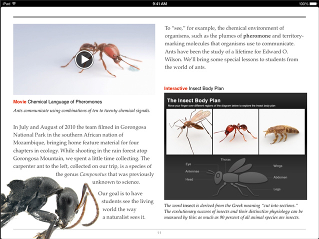
I found this example of an iBook online, it contains some strong elements such as the Insect body plan on the bottom right of the page. As you can see it has three images of real interpretations of ants and then below it has a illustration in the shape of an ant/mosquito. It has clearly emphasised each of the body parts to help the reader understand each part of the body. This will be a very useful interactive element to include in my iBook and I could easily incorporate into a diagram representing trees or a certain mammal for example. Additionally the simple layout with interactive elements around the page such as the video is definitely an aspect I'm going to include. This also will make use of the internet capabilities on the iPad making it overall a more entertaining iBook.


Image sources: http://images.apple.com/au/ibooks-author/images/gallery_html_modules.jpg


Wednesday, 5 March 2014

Chapters, Sections

So since my last post I looked at my previous chapters and sections and thought I'd revise it as my bullet points were very vague and together would of made nothing more than a little list of interesting facts completely missing out the topic of Forests and in this case the Amazon.

I spent two lessons researching and compiling a list of interesting and colourful Mammals, Reptiles & Amphibians, Birds and Trees. I thought if I listed specific animals this would help me not only make my iBook more interesting but also more concise with high quality information and with the added visual aid of colourful animals.

Below is the revised list:


Amazon Rainforest

Chapters:

1. Mammals
Jaguar
Cougar
Golden Lion Tamarin
Black Howler Monkey

2.Reptiles & Amphibians
Poison Dark Frog
Caiman
Giant Amevia
Amazon Boa

3.Birds
The Amazonian Royal Flycatcher
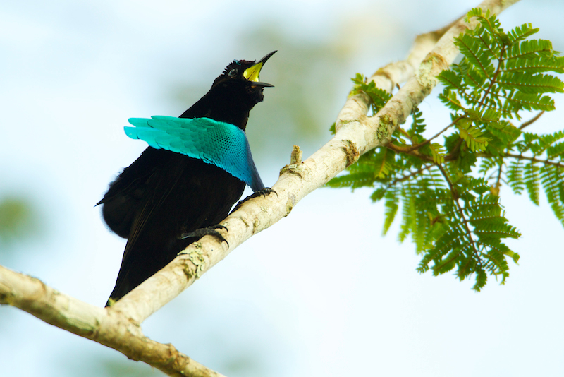
The Superb Bird of Paradise
Toucan
Macaw Parrot

4. Trees
Canopy
Tallest
Most populated
Oxygen Emission and Number of trees

In this new list I feel that each individual section has more potential in terms of entertainment and interest, it gives a better reflection of what makes a forest a forest. Now I've finally got a definite set in stone structure for my iBooks I'm going to start researching and gathering the content for my project.

Here is a preview of some of the creatures I will be covering in my final iBook


·       The Superb Bird of Paradise


·       The Amazonian Royal Flycatcher


Thursday, 27 February 2014

Research Into My Chosen Subject (Forests)

The subject I was assigned was Forests, like I said before I am happy with this subject its an area I know quite a bit about being a David Attenborough fan myself. I thought a good place to start was to watch his series 'Life of Mammals' this will provide me with sufficient information to start getting an idea of the topics to explore.

Here is the list I have created thus far:

Chapters:

1. Mammals
Monkeys
Evolution to survive
Deforestation
Dangers

2.Insects
Number of species
Most Dangerous
Most legs
Most unusual

3.Birds
Most colourful feathers
Unique noises
Largest wingspan
Fastest flyer

4. Trees
Canopy
Tallest
Most populated
Oxygen Emission and Number of trees

I think these four categories are the most entertaining and contain the most interesting information which will make for a more successful iBook. My next step of preparation will be too look at existing iBooks and continue my research into each of the chapters and their sub sections.