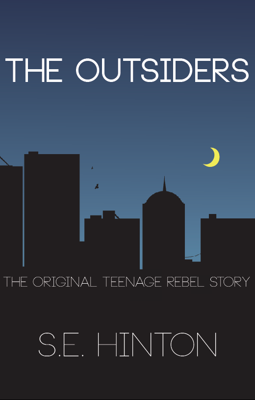
 I really liked the silhouette idea with the skyline of a village, or a church however I felt that was again, too far from the truth. A church does appear in the book and plays a reasonable part in the story however I felt that would of given too much away, or perhaps the wrong impression about the book, and definitely didn't give a gang warfare feel. So I thought I would focus more on the urban city approach and here is what I came up with.
The skyline took a while to draw, one I traced from a picture online and I wanted to get the edges perfect, a clean cut font cover is very important as I think it makes the book instantly attractive, as opposed to a busy choppy rough edge cover. (Thats just my opinion).
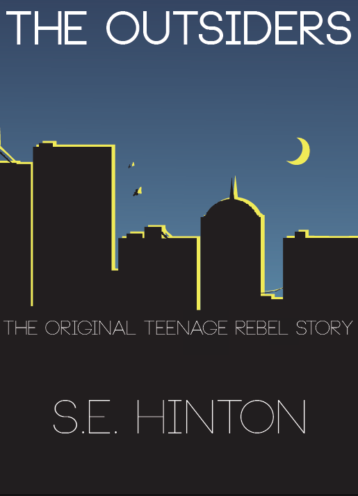
I'm really happy with the Skyline, and it continues onto the backcover, but I still felt it was missing something. So I added another layer of a skyline, in yellow. I thought as I added a moon I could have a 'lit up' edge to them and it would bring the whole book alive, making it more visually interesting.
No comments:
Post a Comment