Monday, 2 June 2014

Website Footer (and Roll-overs)

As most websites traditionally have a footer is a important part of what makes a website a fluid navigational experience. Initially my nav bar was fixed to the top of the page, even when you scrolled it stay at the top, making it an easy way to get around without having to go to the top, however I felt it took away from the rest of the design and as I haven't styled it much yet it just didn't fit. So I then thought how will I tackle this problem of having to scroll to the top when you want to change page, and that got me thinking, footers are usually used for social media icons, location of that company / design agency but that type of information isn't applicable here so I came up with solution of making the footer a very simple 'to the top' anchor and it looks great, it matches the rest of my layout and design and here's how I did it!

Anchors were used to create a link from the bottom of the page, back to the top, so I put an anchors destination <a id=""totop"> </a> immediately after the body tag, this would ensure that it was at the very top of the page and would't go halfway up. I then created a div, and gave it a class of footer, this was a grey box with 100% width just to create the space where it will go, I then put the anchor inside of the div, applied the smooth scroll class which I used for the scroll hint anchor where instead of jumping to the anchor destination it slowly scrolls like you would with your mouse. and I then used an image I found online of an arrow and put that inside the anchor.

Here's the HTML:


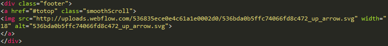
This is the HTML very simply and I did some in-tag styling for the image as I felt it unnecessary to type out the CSS.

Now for the CSS, I wanted the entire footer to be a link to the top, not just the small arrow image so for this I made the anchor position relative,100% height and display:block this gave it 100% width. this then made the entire grey boxed div the anchor making it more user friendly on computers, but also mobiles.
Here is the CSS Code for the Footer Div, and the anchor.

So my footer was there, and was working but now I had to position the arrow image in the center of the div. So I gave it a padding-top and bottom and it inherited the position of the anchor is was within with was centered, putting it straight in the middle. Currently it was now just an light grey arrow inside a dark grey div and didn't really give me the impression that it was a to the top, so I decided the give it a border of 2px, and a border radius of 50px; giving it a circle around the arrow, I then added a pseudo :hover style that changed the border colour from grey, to green (the same color as my nav roll-over). 
Here's the CSS: 
The roll-over was good, but not good enough the sharp snap from grey to green needed to match the rest of the webpage so I did a quick google search and found a ease-in-out transition and I set the transition time to 500ms, now I had the rollover I wanted but the transition only occured when I hovered onto it, when I took my cursor off the anchor it snapped back to grey, then after some research I discovered that you need to apply the transition to the image aswell, not just the pseudo :hover! 
Before :hover

After :hover

Saturday, 31 May 2014

Content Arrangement - Main Section

In this blog post I'm going to be taking your through my methods on how I got my main content area to look how it does.
In the screenshot above you can see how I've displayed my content, a simple 2 x 2 Grid, but to get to this point, it took a lot of work.

Initially I tried numerous methods of displaying my content, huge 100% elements that take up the entire browser but I felt this was too over powering and didn't match the layout of my work thus far, so I looked online for good ways to display content and I tried to get some inspiration, I came across this: FlexBox - This is a brilliant tutorial and so in-depth, it goes through everything that the flex box is capable of. It then has the code you can copy which has the place holders which look like this:


These are the place holders and they stack when resized to this:
And then stacks down into 2 x 3 which is what I wanted, so from the code below I just removed the li class 5 and 6 as I only needed four for each of my topics, mammals, amphibians and reptiles, birds and trees.
Before


After
Here you can see my HTML elaborated from the previous one, where I've added my own content and titles, I've also applied my own div classes to each of the topics, so I could then target the paragraph within without influencing every paragraph in the website. I also used it to wrap the size of the text to a maximum of the same width as the images I used. You will also notice at the top of the screenshot I put the flex container, inside another container as when the screen was big enough my content was going 3 images along and 1 below and it just wasn't consistent. So by putting it another container it restricted the flex container keeping a constant 2x2 until you went down to mobile size where it would become 4x1.

Here's my CSS for the flex boxes:
At the top of the screenshot you can see the container of the flex that I added, I gave it a width of 100% and a simple white background colour, I then added the position of relative so it could be influenced by the z-index (so scroll hint didn't show through)

Next is the flex container, this CSS was part of the code from the website I linked earlier, I simply changed the background colour and added a max-width. I did this so the elements would stack 2 on 2.

Just below that you can see the flex item, now I only included the no.1 as they are all the same with just different background urls. For this I changed the height to 200px and made the margin top 80px (from 10px) to increase the distance between the grey content intro, and the edge of the containerofflex div.

I then added a background URL code which changed the background to an image of choice from the default red one. After I'd done this I felt it needed a bit of 'lifting' so I found this tutorial on how to give a box-shadow that was subtle. -webkit-box-shadow: 0 1px 2px rgba (142,110,132,0.3); is that line of code for that, it basically says give the left and right sides of the container a 1px grey, 30% transparent border and the bottom a 2px one. This is the result.


Like I said, its only a subtle difference but it give the surrounding of my image a slight lift and makes it look that little bit more professional.

The final piece of code that I used for the CSS3 flex boxes is a pseudo :hover command, this essentially is manual for the browser to read that when 'this' happens 'this' also happens, in this case, when you :hover over flex-item1 replace the background: url with this one, in my case the same image with a simple vignette over the top, giving the audience/user some feedback that they have selected this, and it does lead somewhere.

Here is the before and after result:

Before (:hover)


As you can see it adds a very subtle roll-over effect that is nice and simple and looks professional!

In terms of the process I went through to achieve the looks of the text, it was the same as I explained in my previous blog post.


Tuesday, 27 May 2014

Content Arrangement - Introduction

In this blog post I'm going to explain the methods of how I arranged my content.

For my top introduction I made a div called .content-title, I simply gave it a height of 400px, with a background colour of #F2F2F2, I then gave it a position of relative so I could apply a z-index so it would show in front of the scroll hint when you scrolled down. 

I wanted my content to be really simple, making complete use of white/grey space, almost taking after Apple design style/philosophy that clean spaces give a premium appearance. So with my simple grey backgrounded content title with a clean font like Roboto makes for an impressive look.

When styling 'Welcome to the Amazon' I was styling the <h2> tag. I wanted it to be a light font to look at high res as possible and when using 'normal' weights there always seems to be a jagged edge even with the in browser (and operating system) font smoothing. So I chose the weight of 300 which I thought looked really neat, very legible whilst looking professional. I then text-align: centred the text which put it in the middle of the div and gave it a padding-top of 2.25em this moved it down from the top edge further into the middle of the div just creating space around it. I also reduced the kerning (letter spacing) as I felt it was slightly to far apart for my sentence. I then changed the colour to #777 a darker grey than the background as when I tried black it was too harsh. Here is the CSS code:
Next I'll be looking at the h3, I wanted a slightly smaller informing sentence that gave the reader an idea in to what the websites purpose is, I wanted it to be obvious, but at the same time not take any attention away from the main title. So I gave it almost the identical styling at a smaller size however and with slightly more padding-top: 2.85em, here's the CSS:
Now at this point I wanted to have some space in-between the intro and the main content section, a larger border of 200px of grey and then against the white of the content area didn't look very good, heres a screenshot:
As you can see the gap is quite overpowering and looks unfinished, so I decided to add an hr (horizontal rule) so I could try and fill that space with a thin line and it proved to be harder than i originally expected.

At first I just put the HR in the HTML under the introduction text and it was 100% width as it is by default but I didn't think that looks very good, I just wanted a subtle detail which would give some breathing space. So I tried to style the hr by making it 75% width, and then text-align centre however this didn't work, an hr isn't text, nor an image so I was completely left in the dark about how to manipulate it. I googled 'styling an hr' and this page came up giving you everything you can possibly to do style an HR which I found incredibly useful even though the tutorials were styling in-line not on an external style sheet. Link here.

So from following what the webpage said I gave it a border-top of 1px and a margin before of 6ems this spaced it down from the introduction sentence so it wasn't directly beneath, I then gave it a -webkit-margin-start: auto; and -webkit-margin-end: auto; - this centred it in the middle of the page however there was one thing still wrong.
As you can see in the screenshot above the css I gave that only gave a border-top of 1px wasn't being listened too, there was a very feint border around making a rectangle, after a little bit of googling I found that you have to add a 'border: 0;' this removes the border everything else other than in the areas you specify! Here is the hr {} CSS:
Finally, for the 'To discover more, click an image below' section I gave it the same styling as I did to the other sections, and instead of adding the padding to the text, I did it to the HR element as you can see above!

Saturday, 24 May 2014

Smooth Scrolling and Anchors

After gathering inspiration from other websites I found that every website with a similar scroll effect where the header and related elements are fixed and the content scrolls above it all have some sort of 'scroll hint'.

The previous blog post about the website bubblesfilm.com shows a scroll hint at the bottom of the page looking like this:
This animated on hover from one arrow to two and I thought it was a really neat feature, when clicked it just scrolls down the page to a fixed point where the content begins. So I thought to myself how could I get something similar? It would be a great way to prompt the user of the website to scroll down and make sure they don't get bored.

1. My first step was to think about the basics, it's an anchor from one spot on the page to another, and has a :hover state change to a different image with some added animation.

2. Next, I looked at http://www.w3schools.com/html/html_links.asp this gave me everything I needed to know about how to link to another point on the page.
It shows you that if you want to create a link, you must do <a href="#tips"> Link to </a> and then at the destination you set the 'other end' of the anchor with <a id=""#tips"> </a> this takes you to the area in the HTML page in which you put it, in my case where the content begins.

So initially I just positioned a div with a background of #FFF (white) about the size I wanted the button to be, in this case I made it 81px width and 41px height. I also gave it bottom: 0; this puts it at the bottom of its container and then position: fixed; and a left: 48% to center it in the middle of the page. This is what I had: 
So I then applied my newly created class to the anchor by using <a href="example" class="scrollhint"> </a> this then gave the anchor the styles that I gave the the class .scrollhint.

Once I'd done this I added a border radius of 81px to both the top-left and top-right of the div, making it rounded giving a semi-circle look: border-radius: 81px 81px 0 0;  Each number selects, top left, top right, bottom left, bottom right in left to right order. This allows you to just have one line of code for border-radius and not four for each corner. This is the result:
Now all I need to do is add my arrow, and I came to the conclusion that the easiest way to do this was to do a image inside the square, and then on :hover change to another image of an arrow lower down, with a fade transition to make it look animated.
Here is the first state of the arrow.


Here is the second state when hovered, with a fade transition in-between.


Here is the final stage, when the hover animation has completed from the first higher arrow to the second lower arrow.


Finally I had one last problem, when I scrolled down the page the fixed scroll-hint showed above all the other content on the page when I wanted it to go behind it. I gave it a z-index similar to my fixed header/title and content scrolling above. I gave it a lower z-index than the content divs and this did the job.
Here is the HTML anchors:


Here is the final CSS styling:


Wednesday, 21 May 2014

Fixed Header, Scrolling Content

In this blog post I'm going to be taking you through the process in which I did to get my fixed header, behind the front scrolling content.

Considering everything with what I wanted to do had something to do with positioning I knew that the position and display tags would be imperative to its success.

For my background image I found this code online:


Essentially it makes the body tag have a background of a specific url, that wont repeat and will be centered horizontally, and centered vertically and it will be fixed. (wont move when scroll). The height 100% and width 100% make it take up the entire body.

Next was the title to center something and have it in a position of your pleasing is a little tricky when dealing with an element that has to be fixed.

The title was an h1 inside a div called .header:
I gave it a fixed position with a top of 150px this pushed it down slightly, I then text align centered it and it was in the right position!

The additional code just set the font family and the color of the font and the z-index which I will explain shortly.


Here is the h1 that was also influencing the title I spread out the kerning and also set the font weight, (light) and the line height, otherwise the text was on-top of each other making it unreadable!

So far it looked pretty good but I still needed to sort out the scroll that I specifically want.


Centered Title with H1 styling


So the next step for me was to get the content in place so I could see if the scroll actually worked, for this I just created a div called .content-title. which I knew my introduction was going to go in, I made this 100% height and gave it a background color of grey (#F2F2F2). This just gave me something to scroll infront of the home page to see if my scroll effect was working. and here's what happened:
As you can see the title font does scroll down, however it goes in font of the content title div that I put in place, this left me stumped for a long time, I messed around with different positions and displays but had no luck, so I googled for solutions and after a while I found that a the z-index class was used in these situations to create a 'layered' effect on your webpage whereby you could put certain things in front of others, so immediately I went over to w3 schools and found their page on it - http://www.w3schools.com/cssref/pr_pos_z-index.asp

This really helped, I simply applied a z-index class to the title, and the background of a lower value than the z-index I gave the content, this made sure that it would go behind in the situation of a clash, as a result I then had to make sure that everything I was giving a 'layer position' as it were, had the definition of either a fixed, absolute or relative as the z-index can only take effect when they are under those parameters. 

Sunday, 18 May 2014

Another Inspiring Website - Bubblesfilm.com

http://bubblesfilm.com/ is a showcase website for professional simplicity. The ideology that the more you can inform your audience the better I increasingly find untrue. When I'm designing I keep asking myself what elements can I do without? It seems the developers of this website have a similar mindset!
In the screenshot above you're looking at the homepage, its full size image background look cool, and is cool. They have done everything they can to draw as much attention to the picture as that's what important especially for a film company handling everything visual. The high quality image and the subtle thin title fonts give a subversive effect without any background clutter.

The navigation holds true to this same style, a transparent navigation with a very simple bold rollover effect keeps anything colourful the main interaction point. They also have opportunities to get in touch in the top right hand corner of the page if required which is a necessary but sometimes overlooked option.

After I spent a minute or two on the website I realised that the title text had a button that took you to the video from which the background image (constantly changing) was from, allowing you to reach out and discover more with their aid, instead of ramming it down the viewers throat. (a nice touch).
When you scroll down you are greeted with this side the of webpage, a slightly more informative and less visually striking. The navigation bar has changed from the transparent version to this opaque black  navigation to match the content, I like this effect it makes it easier to see against the background and just looks more professional. The manner in which they have displayed the content is good, its simple with just title text and its obvious what you must do next if you want to see the content they have. Its three columns which very neatly collapses down into a 2 x 6 and then into a 1 x 12 suitable for mobiles.
This is the footer of the website, they've done it in a different way, instead of the more traditional tiny 'contact us' option that is the same colour as the background they've gone for a really cool way of displaying how to get in touch, little icons headering the information represent what it is for and a little company badge at the bottom, almost a badge of pride! 

So, what did I like and what didn't I?

+ Full size, no nonsense title page gives you an immediate sense of professionalism and instantly earns your trust as a respected company (which is harder than you think).
+ Navigation is transparent when there is a full size image to look at and opaque when a black background, a really nice touch.
+ Stacking content is fluent and professional and title re-size etc. via media queries.

- Top right social media area should be moved to the footer (in my opinion)
- Font choice is questionable and a more sans-serif clean cut font would be preferable.

Overall this is a great website I've taken many design inspirations from it and will try to adapt them into my own website, the layout itself is a winner. 8.5/10

Thursday, 15 May 2014

OFF14 Barcelona - Day 1

The first day of OFF14 was awesome, everyone was a little anxious at first and didn't really know what to expect as this was most peoples first time at anything like this. As we walked in you were greeted by really friendly, like minded people which instantly made me feel at home! The picture above is what you see when you go in.
Where I was sitting!

Lorem Ipsum (Atelier)

The first speakers I saw were Lorem Ipsum (Atelier) they were a multi-disciplinary design studio and their works main objective is to tease and play with your mind, this really became apparent when they showed us their introduction video to the OFF14 Festival.

Here is the video that they played when opening the festival and it really set the mood for what was to come, it was a burst and overload of creativity that the thousands of people sitting in the conference could relate too being designers of one kind or another. It was made over the space of a year and the shots and editing are awesome. The general idea was to try and tell a story about a couple without them having any facial expressions, purely showing emotion through other mediums such as the setting, actions and colors. This worked really well and would of been very difficult to achieve.


Seb Lester (Typographer)
Next up was Seb Lester a very talented and creator of numerous font families that are very successful such as Neo Sans, Soho, Soho Gothic and more. It's always interesting to see in which direction a speaker is going to go in, whether it be explaining about their life story and how they go to where they are now, or projects they have recently done/most proud of. Seb Lester was neither really, he touched briefly on how he got to where he is now and a little bit about his achievements however for the most part he talked about his current hobbies, and what he does in his spare time which I found really interesting, there was no charade no attempt to glorify his stories just raw talent and creativity. He took us through some of his methods of procrastinating although I would not call it that one of them being calligraphy and how he has really gotten into it recently and has started making little Instagram videos of time lapses of him doing this free hand black-letter text. Here is a link to one: http://instagram.com/p/nS1FmczJ0Z/ He then talked about where he was located and it turns out he live in Lewes! Very strange and what a coincidence!

Overall the first day of OFF14 was an awesome experience, the people there was lovely and the talks were inspiration to say the least! Topped off with perfect weather and perfect food!